Improving Contact Us Page
I redesigned the Contact Us page for a major insurance provider to make it easier for customers to find what they need and reduce unnecessary support calls. The goal was to improve accessibility and help users quickly decide whether to contact an agent or the company directly.
Benchmark Study
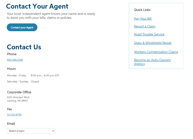
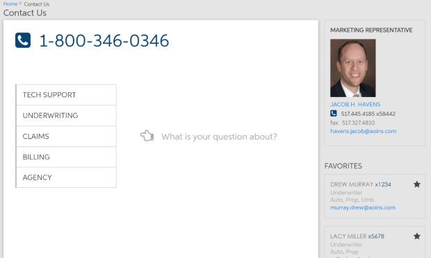
I ran a benchmark study to see how well the Contact Us page worked for users. Through usability tests and interviews, I found that customers were often confused about which contact option to use, leading to frustration and extra calls. Important tabs were hard to find, and the way contact info was grouped didn’t match what users expected.
Ideate
After learning from the benchmark study, I focused on simplifying the Contact Us page to make it more intuitive and user-friendly.
- I revamped the email section to make it easier to spot and use.
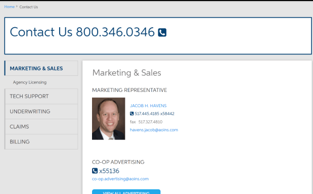
- Contact options were reorganized into clear categories, so users could quickly find what they needed.
- Tabs weren’t working, so I removed them and went with a straightforward layout that put everything front and center.
- I made it crystal clear which questions should go to agents versus the company, helping users avoid confusion.
Prototype
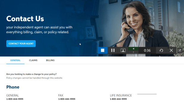
I focused on creating a clean, user-friendly interface that made it simple for users to find the right contact method.
To keep things clear and easy to navigate, I used straightforward headings, added visual cues like icons to highlight key info, and ensured the design worked seamlessly on any device. The result was a modern, minimalistic look that cut out the clutter and made the page more intuitive.
Testing
I tested the redesigned Contact Us page to see how well it worked, focusing on the mobile view since most users access it on their phones.
The usability studies showed a big improvement—users were finding what they needed much faster. I also paid close attention to how they used Google search versus our internal search, which set me up perfectly for my next project: improving the site’s search feature.

Outcome
The redesigned Contact Us page solved the key issues we uncovered in research. By reorganizing info and simplifying navigation, it’s now way easier for users to make decisions. It boosted customer satisfaction and cut down on unnecessary support calls—showing the impact of a user-first design.