Modernizing Quoting Experience
I redesigned the Crime coverage section of a commercial insurance quoting system to make it simpler, cleaner, and easier for agents to use. The goal was to create a more intuitive experience that aligned with business needs and design standards, while seamlessly integrating Crime coverage into the quoting process.
Discover / Define
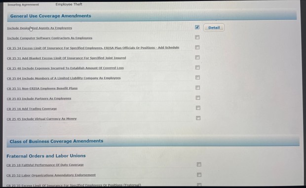
I started by trying to understand the challenges users faced with the current quoting system. The Crime coverage section was a particular focus. I went through the existing documentation and usage data to get a feel for how the current system worked. Then, I met with the business team and stakeholders to understand their goals and what they needed from the redesign. It became clear that the coverage options weren’t very intuitive. The quoting process was more complex than needed. Users were struggling with navigation. My focus was on finding ways to simplify and improve the experience.

Ideate
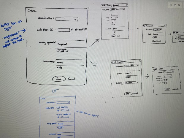
In this phase, I brainstormed and sketched out ideas on my own to improve the Crime coverage experience. Once I had a few solid concepts, I shared them with stakeholders to gather feedback. Through these discussions, we agreed that a step-by-step approach would simplify the process and that clear visuals and consistent terminology were essential. I made sure everything stayed aligned with our design standards.

Prototype
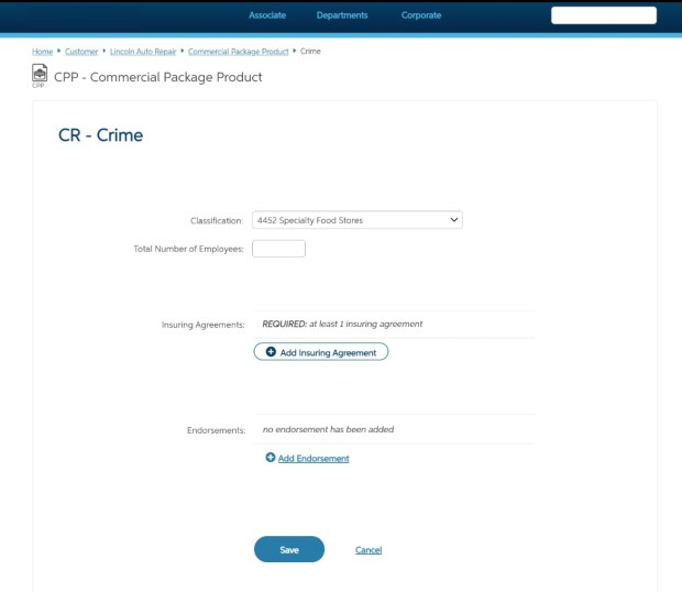
I created wireframes and high-fidelity prototypes in Axure to bring the redesign to life, making sure everything followed our design standards. Sharing these early prototypes with stakeholders sparked great conversations and aligned everyone on the direction. I also worked with developers early to confirm feasibility and reminded the team that the design would evolve after usability testing.

Testing
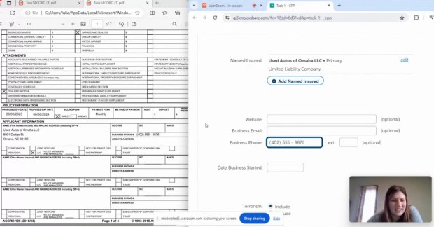
I ran remote usability tests with 6 associates to see how well the prototypes worked and uncover any issues. The biggest pain point was users struggling to figure out how to add Crime coverage when resuming a proposal, often clicking on CGL (a different type of coverage) first by mistake. Once they got to the Crime section, though, entering coverage details was easy. These insights helped me refine the design to improve navigation and make the process clearer.

Outcome
After the usability study, I shared my findings with stakeholders and showed a few UserZoom clips so everyone could see the insights firsthand. I recommended adding coverage part buttons on the hub to improve navigation since the Crime information entry was working well and didn’t need changes. These tweaks were all about making the experience smoother and easier for users.
