Optimizing Complex Systems
This project was my first big challenge as the sole UX designer, and it taught me so much along the way. I was tasked with redesigning the Secured Interested Party (SIP) administration system. The existing system was outdated and made it difficult for users to efficiently complete their tasks. My goal was to make it simpler, faster, and far less frustrating for the people relying on it every day.
Discover / Define
To understand the challenges, I spent half a day observing the primary user navigating the current system. It quickly became clear that the process was inefficient and frustrating. Here’s what I discovered:
- it simpler, faster, and way less frustrating for the people using it every day. a single task, which wasted time and increased the chance of errors.
- Manual Tracking: To keep track of updates, users resorted to emailing themselves, which disrupted their workflow and felt outdated.
- Irrelevant Notifications: Notifications were sent unnecessarily, adding clutter and wasting resources.
These pain points helped me define the goal: create a unified system where users could manage SIP updates efficiently without juggling multiple platforms.


Ideate
Once I had a handle on the problems, I brainstormed solutions by asking questions like:
- How can we combine everything into one system?
- How can we make updates automatic, so users don’t have to email themselves?
- How can we make notifications smarter and more useful?
I sketched out a bunch of ideas in Lucid and worked with my design lead to narrow them down. We came up with three workflows that could work, then checked in with stakeholders and IT to make sure everything was doable.

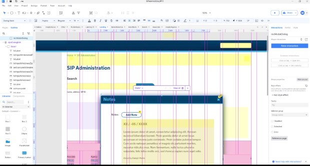
Prototype
With the plan in place, I built a detailed prototype in Axure. Some of the highlights included:
- A single, unified interface for all SIP updates.
- Automatic tracking of changes, so users didn’t have to keep manual records.
- A smoother way to merge SIPs, especially when companies got acquired.
- Clear notifications that showed only what was needed, cutting out the noise.
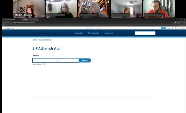
Testing
I tested the prototype with the main user and a few others to see how well it worked. Watching them go through tasks, I spotted a big issue: there wasn’t enough of a warning before merging SIPs, which could cause big problems. I added an extra confirmation step and more info on what merging would do.
When the user tested the updated version, her response was, “This is so much easier, wow it’s like it was made for me.”
Outcome
The new system simplified everything by bringing all the tools into one place. Users no longer had to juggle multiple systems or waste time on manual tracking. The merge process became much easier to follow, and notifications were reworked to focus on what really mattered, saving both time and resources. This project taught me the importance of digging deep into research, collaborating with teams to create effective solutions, and designing with the user’s needs at the center of everything.
