Overview
I was asked to redesign the Crime coverage section for a commercial quoting system. The goal was to make sure it aligned with what the business and stakeholders needed while keeping it user-friendly. The old setup wasn’t engaging enough, which made it tough for agents to understand and quote the new coverage. So, I aimed to simplify navigation and seamlessly integrate Crime coverage into the quoting process.
Discover / Define
Objective: To understand the current challenges users face with the commercial quoting system and identify opportunities for improvement in the Crime coverage section.
Method: Reviewed existing documentation and usage data from the current system to understand current workflows. Met with business and stakeholders to talk about business goals.
Findings: Business revealed that existing coverage options needed to be clearer, while also highlighting the complexity of the quoting process for this coverage and a desire for simplified navigation
Ideate:
Objective: To generate a range of design ideas that effectively address user needs and enhance the Crime coverage experience.
Method: Conducted brainstorming sessions with the design team and stakeholders, sketching out multiple concepts for the coverage options. Encouraged collaborative feedback to refine ideas.
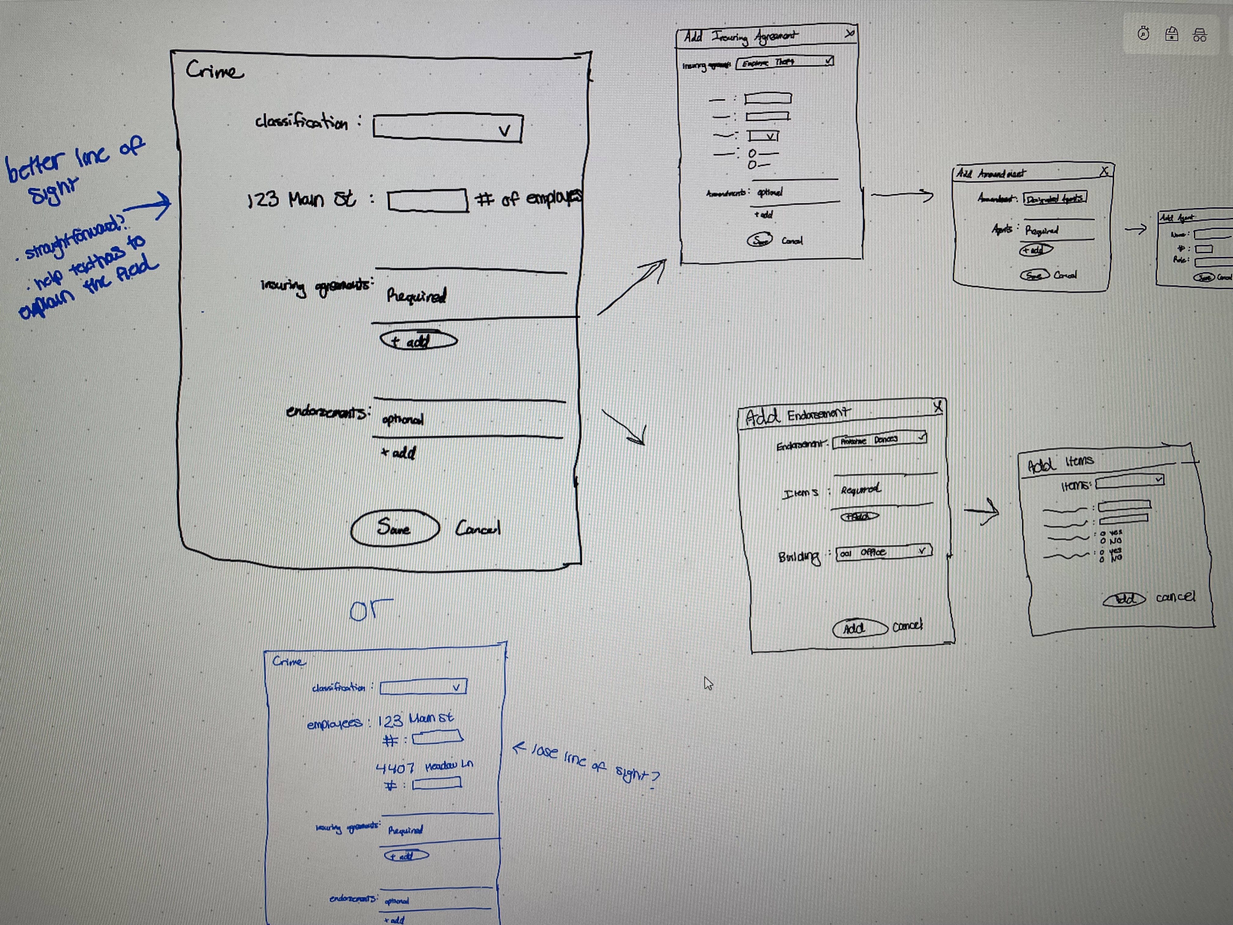
Findings: Through many discussion internally and with business it was suggested a step-by-step approach for selecting Crime coverage might help reduce overwhelm. We all agreed that clear visuals and consistent terminology were key, so I made sure to follow our existing design patterns to keep everything aligned.
Prototype:
Objective: To create interactive prototypes that visualize the proposed design for the Crime coverage section.
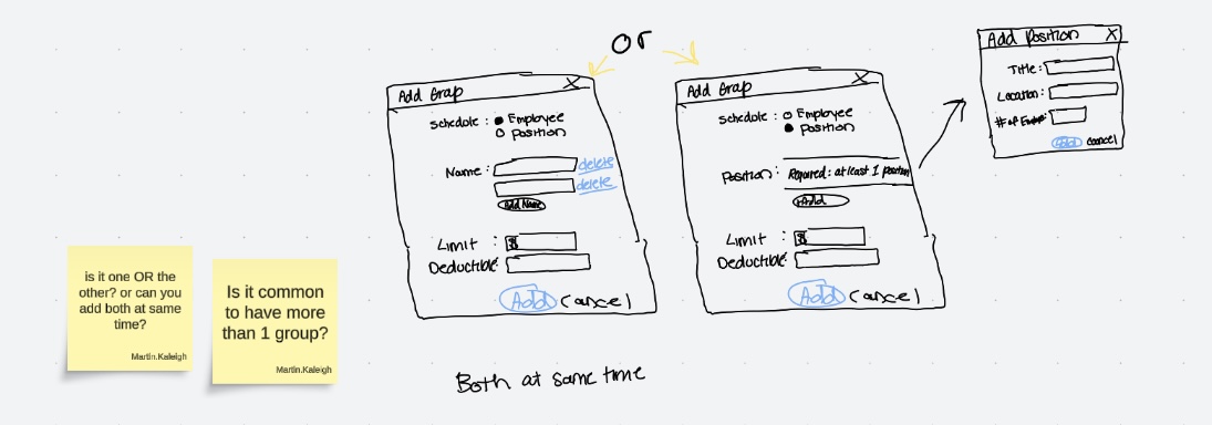
Method: Developed low-fidelity wireframes followed by high-fidelity prototypes using Axure. Ensured that the prototypes adhered to the existing design standards and guidelines.
Findings: The prototypes kicked off early conversations with stakeholders and helped everyone see the design direction clearly. I also collaborated with developers early on to ensure everything was doable. I made sure to remind everyone that nothing was set in stone until we ran a usability study to uncover any potential pain points.
Testing:
Objective: To assess the usability of the prototypes and address any pain points in the workflow of the Crime main page structure while gathering actionable feedback from users.
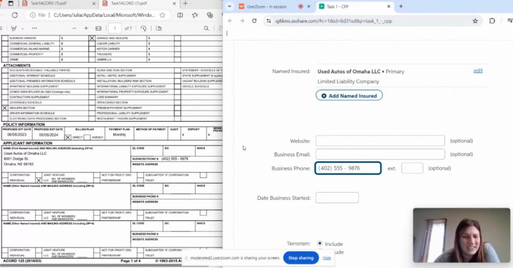
Method: Conducted remote moderated usability testing with 6 associates, observing their interactions with the prototypes to evaluate the Crime main page structure.
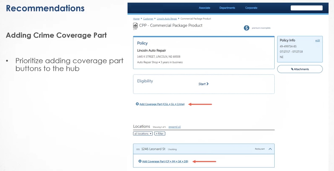
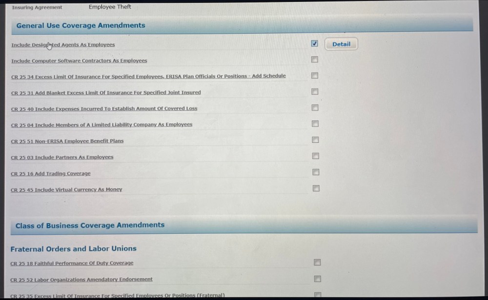
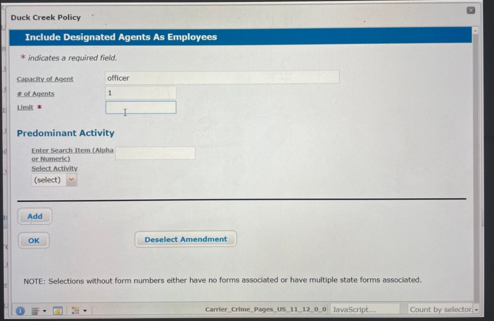
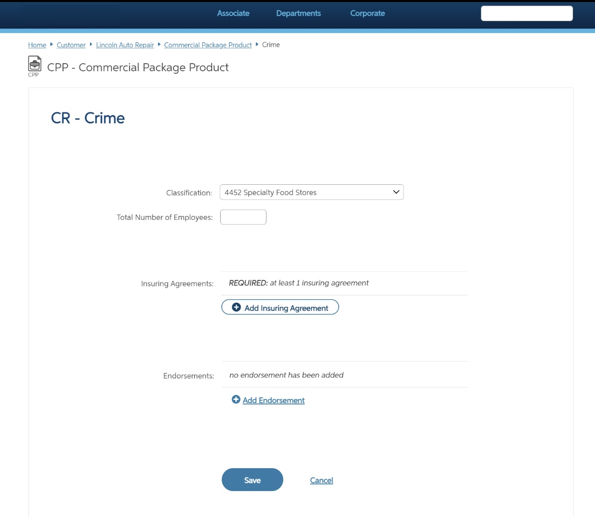
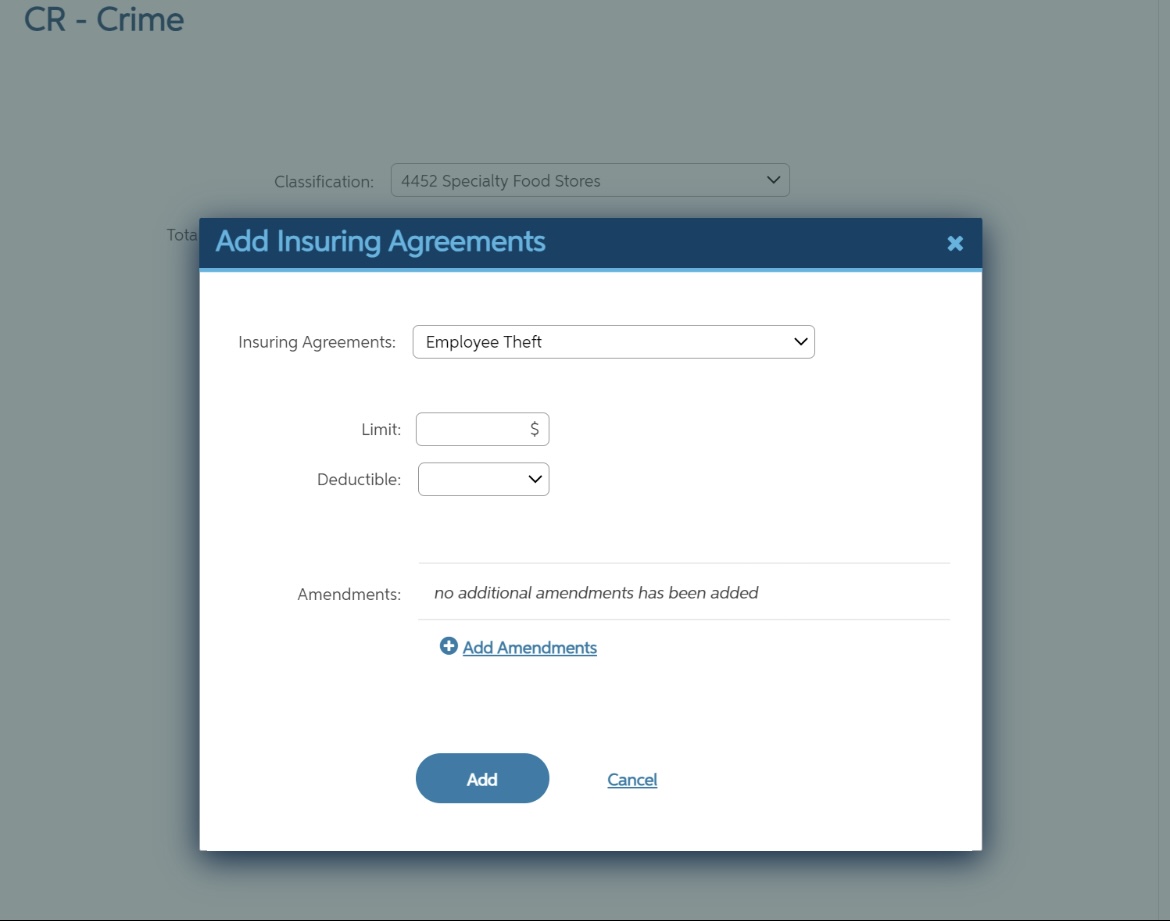
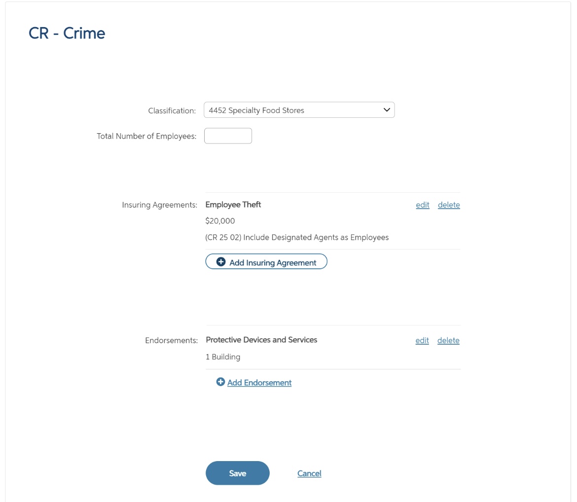
Findings: The usability study revealed some key pain points in the workflow for selecting Crime coverage. Most participants struggled to figure out how to add Crime coverage when resuming an already started proposal, often clicking on CGL first. This confusion highlighted the need for clearer navigation and guidance. However, once participants accessed the Crime section, they found it straightforward to enter the coverage information. These insights informed further design iterations to enhance the user experience.
Outcome
After the usability study, I presented my findings to the stakeholders and shared several UserZoom clips, ensuring everyone on the large team could gain insights, even if they couldn’t observe the study in person. I recommended prioritizing the addition of coverage part buttons on the hub to improve navigation. The Crime information entry is working as intended, so I didn’t suggest any changes there. These adjustments aim to further streamline the user experience and make accessing coverage options even easier.