Overview
I was tasked with redesigning the Contact Us page for a major insurance provider to enhance user accessibility and streamline the contact process. The original page had issues with user engagement, leading to a high volume of unnecessary support calls. My goal was to make it easier for customers to find the information they needed and reduce the friction in deciding whether to contact an agent or the company directly.
Benchmark Study & User Research:
Objective: To determine whether the contact information was grouped logically from a customer’s perspective, evaluate the discoverability of the tabs, assess how well the page facilitated customer decision-making regarding what to ask an agent vs. Auto-Owners, and evaluate the use of the email section.
Method: Conducted a benchmark study with Associates to gather data on user behavior and preferences. This involved usability tests and interviews, where participants navigated the Contact Us page and provided feedback on its layout, clarity, and usefulness.
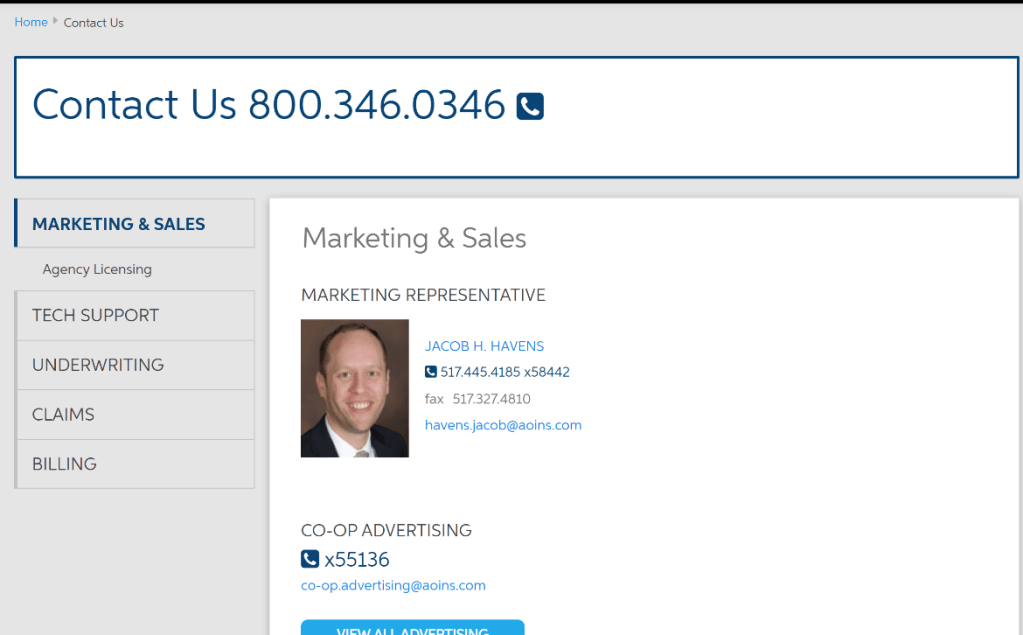
Findings: The study revealed that customers were often confused about which contact option to use, leading to frustration and unnecessary calls. The discoverability of important tabs was low, and the grouping of contact information didn’t align with customer expectations.
Wireframing & Prototyping:
Objective: Based on the findings from the benchmark study, I began trimming unnecessary content and brainstorming different ways to layout the information to create a more intuitive and user-friendly experience.
Key Changes:
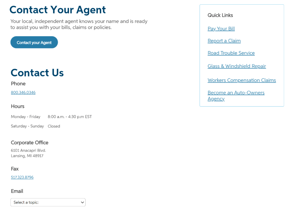
- Streamlined Email Section: I gave the email section a bit of a makeover, making it more prominent and easier to access. It’s now positioned where users can easily spot it if they prefer to reach out via email.
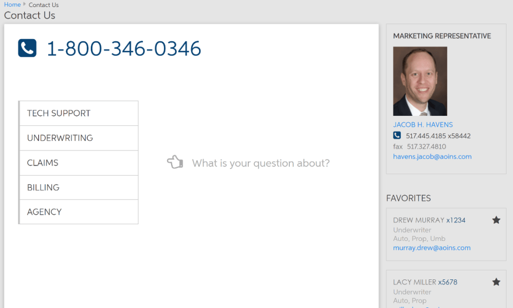
- Reorganized Contact Options: I grouped the contact options into clear, easy-to-navigate categories that matched the most common customer inquiries. This made it a lot simpler for users to quickly find the right contact method.
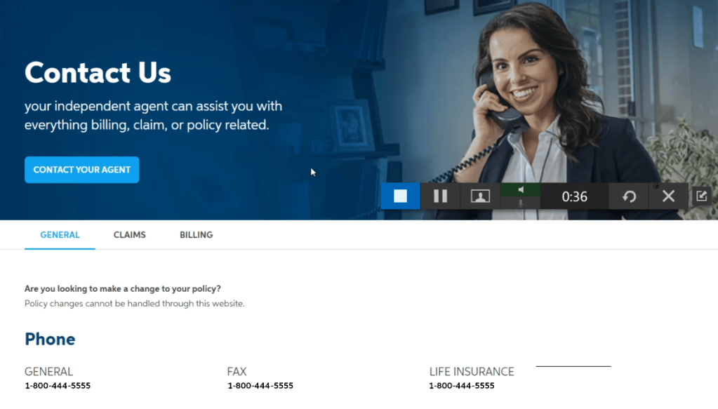
- Removed Tabs for Better Discoverability: The tabs weren’t working at all—people just weren’t finding them. So, I decided to remove them completely and replace them with a more straightforward layout that put everything front and center.
- Simplified Decision-Making: I made it super clear which questions should go to agents and which should be directed to the company. By using clear sections and labels, customers could easily figure out who to contact without second-guessing.
Design:
Objective: I wanted to create a clean, user-friendly interface that made it easy for users to find the right contact method.
Approach: I went with a modern, minimalistic design that focused on keeping things clear and simple. The goal was to cut down on clutter and make sure the most important contact options were easy to spot.
Design Elements:
- I used clear, straightforward headings and labels to help guide users through the page.
- Added some visual cues like icons and highlighted sections to draw attention to the key information.
- Made sure the design was responsive, so it looks good and works smoothly on any device.
Testing:
Objective: I wanted to see how well the redesign worked in real-world scenarios and if it made things easier for users.
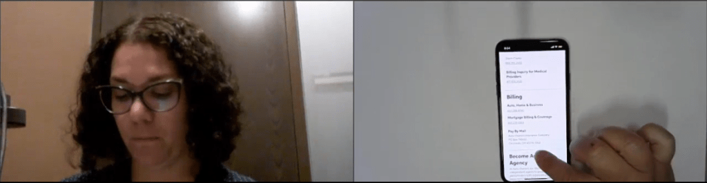
Method: With the updated prototype based on my research, I conducted another round of usability studies. I focused a lot on the mobile view since most customers would be checking the contact page on their phones.
Focus Areas: I looked at how customers were getting in touch with us, whether the contact info was grouped in a way that made sense to them, and how they used Google search versus our internal search. This was important because my next project was to improve the search feature on the public site.
Results: The usability studies showed a big improvement in user engagement—people were finding the info they needed much faster.
Outcome
The redesigned Contact Us page really tackled the main issues we found during research. By reorganizing the contact info, making things easier to find, and helping users make quicker decisions, the page now offers a much smoother and more intuitive experience. Not only did this boost customer satisfaction, but it also cut down on unnecessary support calls, proving just how powerful a user-centered design approach can be.